Make Small Rooms Feel Expansive with Texture and Craft
We’re exploring Small-Space Depth: Creating Dimension with Rugs, Weaves, and Finishes—practical, sensory strategies that make compact rooms feel layered, airy, and inviting. Learn how fiber, pile, and sheen manipulate sightlines, encourage movement, and carve zones. Bring questions, share photos, and join our community rethinking scale, light, and touch.


Understanding Perceived Depth
Before buying anything, understand why the eye reads depth. Our brains notice contrast edges, directional cues, and texture gradients more than square footage. By controlling floor pattern, pile height, and finish reflectivity, you can lengthen sightlines, soften corners, and pull attention through. Comment with your trickiest layout puzzles today so we can troubleshoot depth together.
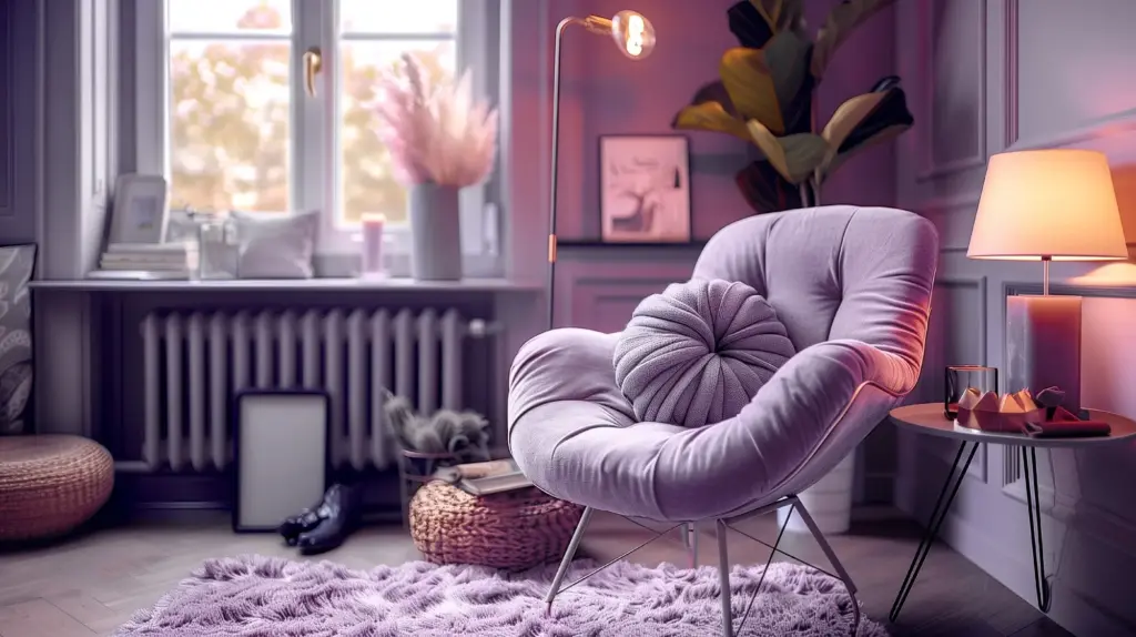
Rugs that Stretch the Floorplane
The right rug can act like a lens that widens perspective lines. Choose proportions that extend under major pieces, then let edges run open where you want flow. Low, dense piles calm visual noise; medium piles invite shadow play. Ask about pile heights and underlays below, and share what’s underfoot in your space right now.
Weaves that Catch Light
Texture sculpts light, and light sculpts space. Loops, slubs, and bouclé create micro-shadows that enrich depth without busy patterning. Tight, flat constructions reflect more evenly, while chunkier yarns scatter brightness for dimensional softness. Mention pets, allergies, or maintenance needs in the comments, and we’ll pinpoint a weave profile that balances beauty with everyday life.
Finishes that Recede or Advance
Surface sheen redirects attention. Matte finishes absorb light, allowing walls to recede; semi-gloss details punctuate edges for gentle emphasis. On floors, satin or oiled looks keep reflections quiet, letting rugs star. On metallics, brushed textures soften sparkle. Describe your windows’ orientation, and we’ll tune finishes to welcome daylight while deepening the room’s perceived volume.
Matte Depth vs Gloss Pop
Use matte expanses where you need distance—walls, ceilings, large cabinets—then reserve gloss for trim or small accents that catch the eye and guide movement. Balance is key: too much gloss compresses, too much matte feels flat. Share a snapshot of your brightest corner, and we’ll place controlled shine to elongate lines without glare.

Limewash, Plaster, and Low-Sheen Stories
Limewash and plaster finishes deliver gentle variation that reads like atmospheric depth, almost a landscape across your walls. Their low-sheen, clouded texture diffuses light into soft gradients, stealing focus from tight dimensions. Pair with a heathered rug for harmony. Tell us your paint history and tolerance for texture, and we’ll propose a breathable, timeless finish.

Wood Tones, Metals, and Soft Sheen Balances
Mid-tone woods with a natural oil finish ground rooms calmly, while brushed brass or burnished nickel provide warm, controlled glints. Avoid competing mirrors of shine; instead, stagger reflectance across planes. Connect finishes to rug fibers—jute warms oak, wool cools walnut. List your existing metals and wood species, and we’ll refine a cohesive reflectance map.
Color, Pattern, and Rhythm
Color sets distance cues. Low-contrast palettes calm and feel broader; directional patterns pull the gaze along chosen paths. On floors, restrained motifs suggest movement without crowding. Let rugs carry rhythm, finishes provide quiet backdrops, and weaves add readable texture. Share swatches or screenshots, and we’ll orchestrate harmony that deepens space yet preserves personality.
Low-Contrast Palettes with High Texture
Combine cousins on the color wheel—oat, mushroom, stone, and fog—then layer texture to keep interest alive. High texture within a soft palette reads expansive because edges merge gently. Add a faint heather or tweed underfoot, and walls feel further. Upload your favorite neutral trio, and we’ll suggest fiber blends that widen without washing out.
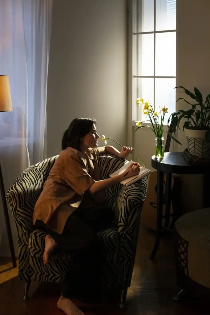
Stripes, Herringbone, and Directionality
Directional patterns steer sightlines. Lengthwise stripes elongate narrow rooms; herringbone subtly advances and recedes with a lively cadence. Keep contrasts tight to avoid jitter. Align rug stripes with window light for a gentle runway effect. Share the shortest wall measurement, and we’ll propose directional patterns that lengthen travel visually, guiding footsteps and curiosity forward.
Studio Case Study: Expanding a 26 m² Nest
We partnered with a reader whose studio felt crowded by scattered mats and shiny paint. One large wool flatweave unified zones; a bouclé runner layered at the bed added shadow depth; limewash cooled glare. The room gained visual length and calm. Tell us your square meters, and we’ll sketch a similarly clear, transformative three-move plan.
Sourcing Checklist and Budget Tiers
Start with exact room measurements, doorway clearances, and turn radii. Prioritize the biggest rug first, then task lamps, then finish adjustments. Tier your budget: essential, upgrade, heirloom. Mix new with vintage for soul and savings. Comment with your ceiling height and spending cap, and we’ll generate a personalized shortlist, links, and sequence of actions.
Care, Longevity, and Sustainable Choices
Depth lasts longer when materials age gracefully. Choose wool for resilience, cotton for washability, jute for grounding texture, and smart underlays for stability. Favor plant-based finishes and low-VOC walls. Rotate rugs seasonally to even wear. Share your household realities—kids, pets, allergies—and we’ll match fibers and finishes that protect health, budget, and beautifully layered depth.