Touch-Led Design: Weaves, Grains, and Sheens in Harmony

We’re diving into “Crafting a Tactile Palette: Coordinating Weaves, Grains, and Sheens,” exploring how fiber structure, wood figure, and finish luster choreograph light, mood, and durability. Expect practical frameworks, sensory tests, and real stories that help you pair bouclé with rift-sawn oak, satin lacquer with honed stone, and linen with patinated brass. Bring your swatches, curiosity, and camera; we will experiment, compare, and refine until surfaces sing together and your hands confirm what your eyes only guessed.

How Touch Shapes Perception and Comfort

Before choosing colors, train your fingertips. Tactile cues steer expectations about warmth, acoustics, and care; a nubby weave quiets echo, tight grain feels ordered, and high gloss shouts precision. We connect haptics, neuroaesthetics, and daily rituals into decisions that reward touch, calm nerves, and hold up to life.
Test textiles blindfolded and note temperature, friction, spring, and sound. Bouclé cushions footsteps and hides creases; crisp linen breathes and reflects light softly; twill slides under hand with confident directionality. Record feelings first, then assign each role: anchor, accent, or counterpoint within your material story.
Quartered oak gives linear calm and dimensional stability; walnut swirls read warmer and more expressive; ash telegraphs strong pores inviting open-pore finishes. Run your fingers across and along the grain, compare resistance and noise, then match the figure to required durability, rhythmic order, and emotional temperature.

Building a Hands-On Materials Library

Curating Textile Decks That Age Well

Group fabrics by weave architecture—plain, twill, satin, bouclé, velvet—and by abrasion ratings. Rub samples with a coin, spill water, then steam and brush. Track pilling, recovery, and color shift, so your most tactile surfaces welcome guests today and still photograph beautifully years from now.

Wood Bundles for Honest Comparisons

Assemble rift, quartered, and plain-sawn boards of the same species, finished in matte oil, satin waterborne, and high-gloss lacquer. Compare chatoyance, pore fill, and edge crispness. Mark how each reads beside boucle or linen, and decide where control, warmth, or drama should lead.

Finish Fans and Lighting Diaries

Create fan decks of varnishes, oils, waxes, powder coats, and metallic patinas. Log every sample under north light, warm LEDs, and candlelight. Note fingerprints, glare, and color cast. Your diary prevents costly surprises and anchors confident choices when presentations and deadlines squeeze.

Light, Shadow, and Reflectance as Co-Designers

Texture lives or dies in light. A deeply brushed oak becomes quiet under diffuse light yet leaps forward beside a glossy black cabinet under a narrow beam. We test angles, color temperature, and beam spreads to tune weave shadow, grain legibility, and sheen sparkle, ensuring mornings feel gentle and evenings host with poised energy.

Composing a Tactile Palette With Ratios and Roles

Great rooms read like music. Establish a grounding majority, a character-forward minority, and a disciplined sparkle. We set ratios—70 percent calm, 25 percent articulate, 5 percent luminous—then assign materials to each role. This prevents shouting matches between active grain, bold weave, and aggressive gloss, yielding coherence that still feels playful and alive.

From Concept to Rooms: Translating Choices

We bridge drawings and daily life by mocking up vignettes at full scale, then living with them for a week. Sofas get sheets of sample fabric, cabinet doors borrow finish panels, and end tables host competing glosses. Observations and stains are welcome; iteration invites honest feedback, engagement, and confident sign-off from everyone using the space.

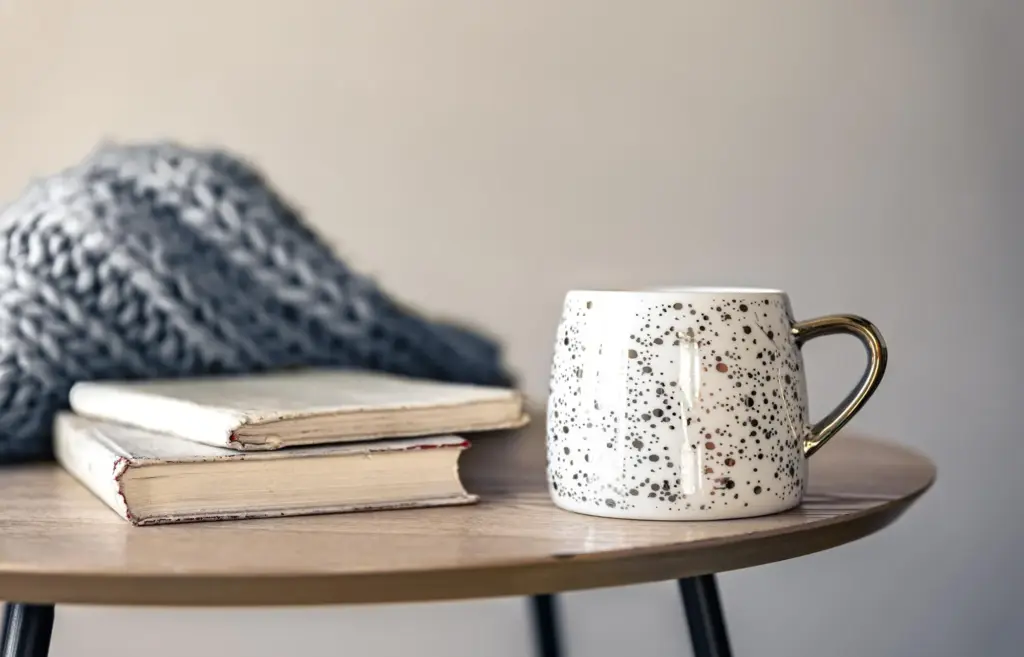
Living Room: Social Comfort With Quiet Drama

Pair a tactile, high-abrasion bouclé on the sofa with rift-sawn oak shelving finished in low-sheen oil. Introduce a satin brass arc lamp that throws a warm ellipse across a wool rug. Invite guests to comment, and adjust ratios until conversation, light, and maintenance feel balanced.

Kitchen: Workhorse Surfaces That Photograph Beautifully

Specify honed quartzite that resists etching, quartered oak fronts with pore-filling to reduce crumb snags, and a satin ceramic tile backsplash for wipeable sparkle. Under-cabinet lighting should soften reflectance. Test tomato, wine, and coffee; cleaning notes go on the inside of a door for future you.

Bedroom: Restful Layers and Whispered Highlights

Lean into percale or washed linen for temperature regulation, a cork side table for soft landings, and matte paint that swallows morning glare. A tiny gloss ceramic lamp base gives a star point. Prioritize fingertips at night, and your eyes will close sooner.

Sourcing With Integrity and Longevity

{{SECTION_SUBTITLE}}

Certifications, Declarations, and Real Talk

Look for FSC, PEFC, OEKO-TEX, and third-party emissions data, but always call suppliers to confirm actual processes. Ask about dyes, resins, and recycled content. Share findings with your community, inviting accountability, questions, and collective pressure that rewards better practices across mills, forests, and finishing shops.

Healthy Air, Healthy Hands

Prioritize low-VOC finishes, natural oils with transparent chemistry, and powder coats cured correctly. Ventilate during application and curing, test odors in mockups, and avoid finishes that demand harsh cleaners. Comfortable hands and lungs ensure your most loved surfaces stay touched, not cautiously avoided.

Care, Patina, and the Passage of Time

Textile TLC Without Fear

Vacuum gently with a brush, dab spills with cool water and mild soap, and steam to lift compressed loops. Keep a fabric shaver for pills and a test swatch for cleaners. Share a one-page care card, inviting questions so small mishaps never escalate.

Wood and Finish Refresh Cycles

Schedule light re-oiling before dryness shows, buff satin lacquer annually, and protect high-gloss zones with felt and soft cloths. When scratches arrive, photograph, test in hidden areas, and document a step-by-step fix that even future homeowners can follow with confidence.

Community, Feedback, and Evolving Tactility

Invite readers to post swatch photos, lighting tests, and patina wins in the comments. Host quarterly check-ins, publish revisions, and update the materials library together. Shared problem-solving keeps projects evolving gracefully and teaches newcomers why texture decisions matter long after move-in day.
Lumavexonovipalonari
Privacy Overview

This website uses cookies so that we can provide you with the best user experience possible. Cookie information is stored in your browser and performs functions such as recognising you when you return to our website and helping our team to understand which sections of the website you find most interesting and useful.